Offer a semiotic analysis of the connotations of different typefaces.
For general guidance about what is expected in your essays for this module,
see the
general criteria.
Please remember to avoid footnotes and to include an
alphabetical list of 'References' which have been cited in the text
(not a Bibliography of anything you have read for the essay). This list should include
author's names, date, book titles (in italics), place of publication and publisher.
Within the text always cite author's surname, date and page number. Double-space your
text and number your pages. For more detailed notes on writing essays in this
department, click
here.
Advice for this particular assignment:
NOTE: You may not choose this assignment if you have taken the
Website Design Issues module.
Clearly you must demonstrate your understanding of the concept of connotation, but you will find it useful
also to invoke the concepts of codes and the commutation test. Refer to (and illustrate) 12-15 well-known
typefaces, including some from both the serif and sans serif type families, a Script, and at least one italic form and
one bold form. It is important to include a range that reflects the likely connotations listed below. Your selection should
include, among others: Times Roman, Helvetica, Verdana, Courier and Comic Sans.
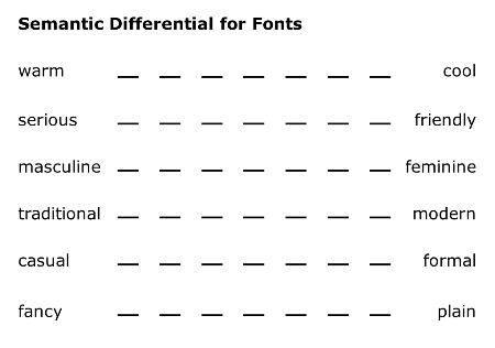
Carry out a survey of at least 20 males and 20 females aged 18-24 to investigate the connotations of your selected fonts using the
Semantic Differential, with these poles: warm/cool; friendly/serious; masculine/feminine; traditional/modern; casual/formal; fancy/plain.
In addition, ask them which one is their favourite, which they dislike the most and which they would choose for the main text
(not a logo) in posters advertising a trendy coffee-shop (ask them why).
It would be best to show them the same text in each of your chosen fonts (on paper on on screen).
Display the results using barcharts and tables as appropriate. How far are the connotations shared by all of your
respondents? About which fonts is there the most agreement? Which fonts are seen as most masculine, and which as most
feminine, and how does this accord with existing findings on this issue? Which connotations are seen as 'going together with'
which other connotations - for instance, how close is the correlation between friendly/serious and warm/cool?
Note also that this is an assignment for which the
inclusion of relevant pictorial illustrations is required.
Remember to include a list labelled either Figures or Image sources after your
list of References.
Some suggested reading
- Baines, Phil & Andrew Haslam (2002)
Type & Typography. London: Laurence King
- Barnard, Malcolm (2005)
Graphic Design as Communication. London: Routledge
- Beaumont, Michael (1987)
Type & Colour. London: Phaidon
- Bernard, Michael, Melissa Mills, Michelle Peterson, & Kelsey Storrer (nd)
'A Comparison of Popular Online Fonts: Which is Best and When?'
[WWW document] URL
http://psychology.wichita.edu/surl/usabilitynews/3S/font.htm
- Brumberger, Eva R. (2003) 'The Rhetoric of Typography: The Awareness and Impact of Typeface Appropriateness',
Technical Communication 50(2): 224-231
- Carter, Rob, Ben Day & Philip Meggs (2002)
Typographic Design: Form and Communication (3rd Edn).
New York: John Wiley
- Chandler, Daniel and Rod Munday (2011)
Dictionary of Media and Communication.
Oxford: Oxford University Press
- Davis, R. C. & Hansel J. Smith (1933) 'Determinants of Feeling Tone in Type Faces',
Journal of Applied Psychology 17: 742-764.
- Frere-Jones, Tobias (2000) ‘Drugstore Travelogue’. In
Steven Heller (Ed):
Sex Appeal: The Art of Allure in Graphic and Advertising Design. New York: Allworth Press, pp. 40-42
- Garfield, Simon (2010)
Just My Type. London: Profile
- Gutjahr, Paul C. & Megan L. Benton (Eds) (2001)
Illuminating Letters: Typography and Literary Interpretation.
Boston, MA: University of Massachusetts Press
- Hallock, Joe (2003) ‘Color Assignment’
http://www.joehallock.com/edu/COM498/index.html
- Haskins, Jack B. (1958)
‘Testing suitability of typefaces for editorial subject-matter’, Journalism Quarterly 35: 186-194
- Haskins, J.B. & L. Flynne (1974)
‘Effects of headline typeface variation on reader interest’,
Journalism Quarterly 51(4), 677-682 [gendered fonts]
- Headley, Gwyn (2005)
The Encyclopaedia of Fonts. London: Cassell
- Jaspert, W. Pincus, W. Turner Berry & A. F. Johnson (2009)
The Encyclopedia of Typefaces. London: Cassell
- Kastl, Albert J. & Irvin L. Child (1968)
‘Emotional Meaning of Four Typographical Variables’, Journal of Applied Psychology 52(): 440-446
- Meggs, Philip (1992)
Type and Image: The Language of Graphic Design. New York: John Wiley
- Mick, David Glen & Laura G Politi (1989) 'Consumers' Interpretations
of Advertising Imagery: A Visit to the Hell of Connotation'. In
Elizabeth C Hirschman (Ed.): Interpretive Consumer Research.
Provo, UT: Association for Consumer Research, pp. 85-96
- Moss, Gloria (2009)
Gender, Design and Marketing. Farnham: Gower.
- Peacock, Ian (2005)
‘From Arial to Wide Latin’ (Radio Broadcast). London: BBC [WWW document] URL
http://www.bbc.co.uk/radio4/science/fromarialtowidelatin.shtml
- Rowe, Camille L. (1982)
'The Connotative Dimensions of Selected Display Typefaces',
Information Design Journal 3(1): 30-37
- Samara, Timothy (2006)
Type Style Finder. Gloucester, MA: Rockport
- Sassoon, Rosemary (Ed.) (1993)
Computers and Typography, Vol. 1. Oxford: Intellect
- Sassoon, Rosemary (Ed.) (1993)
Computers and Typography, Vol. 2. Oxford: Intellect
- Schmitt, Bernd & Alex Simonson (1997)
Marketing Aesthetics: The Strategic Management of Brands, Identity, and Image. New York: Free Press
- Sigman, Aric (2001) 'Everything You Should Know About Fonts -But Probably Don't'
Independent Business Today 4(2): 28-30;
[WWW document] URL
http://www.ibpl.co.uk/ibt.pdf
- Smith, Ken et al. (Eds) (2005)
Handbook of Visual Communication. Mahwah, NJ: Erlbaum
- Sonesson, Göran (1988)
Pictorial Concepts: Inquiries into the Semiotic Heritage and its Relevance for the
Analysis of the Visual World. Lund: Lund University Press
- van Leeuwen, Theo & Carey Jewitt (Eds.) (2001)
Handbook of Visual Analysis. London: Sage
- White, Alex W. (2007)
Advertising Design and Typography. New York: Allworth Press
- Will-Harris, Daniel (2003) ‘EsperoFonto Typeface Selection System’
http://www.will-harris.com/esperfonto/index.html
Note: Treat with extreme caution sources labelled with this symbol!