As part of our imposition of meaning on what we see we seem to seek to turn images into objects where possible. Look at the following image...
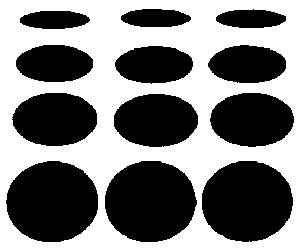
Although it does not strictly follow the rules of linear perspective, we tend to interpret what we see here in terms of three recurrent black circular shapes (at the bottom of the image) repeated into depth, as if printed on a cylinder. Strictly speaking, this would necessitate the 'further' shapes being depicted closer together but that doesn't seem to stop us from reinterpreting the shapes as the same shapes but at different angles. Such impositions of depth can be seen as trying to make the shapes more like tangible 3D objects. Where an image seems to lend itself to a possible interpretation in 3D we seem to prefer this interpretation.
Here is an image which is familiar in psychology textbooks in one form or another...
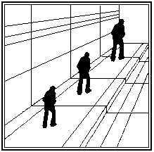
We all know that the figures in this kind of image seem to get larger as they near the top right-hand corner, although we also know from previous encounters with such images that the three figures are in fact all the same size. We find it hard to avoid interpreting the converging lines as indicating linear perspective, which requires us to accept that the figure is breaking the rules by seeming to be larger rather than smaller as it gets further away. The desire to interpret in depth seems to be very strong in us if we are familiar (however unconsciously) with linear perspective.
 For reference, it may be useful to know that the simplest version of
such illusions deriving from linear perspective is called the 'Ponzo
illusion'. In this basic version, there are two lines converging
towards the top of the image, together with two horizontal lines. The
horizontal line (a) at the top is seen as larger than the
horizontal line (b) at the bottom (even though both are the
same size).
For reference, it may be useful to know that the simplest version of
such illusions deriving from linear perspective is called the 'Ponzo
illusion'. In this basic version, there are two lines converging
towards the top of the image, together with two horizontal lines. The
horizontal line (a) at the top is seen as larger than the
horizontal line (b) at the bottom (even though both are the
same size).
Linear perspective is only one kind of depth cue in a static two-dimensional image such as a painting, drawing or photograph. Relative size is another depth cue. Where an image features several objects of similar shape, the tendency is to assume that the smaller objects are further away. This is especially so with familiar objects (the 'familiar size' of which is known). Texture gradient (or detail perspective) can be seen as a combination of linear perspective and relative size. Where an image is full of similar shapes which are fairly evenly-spaced (such as pebbles on a beach), the shapes that seem more densely packed together are seen as being more distant.
Height in field (or plane) (also called relative height) is another cue to judging depth. The usual assumption is that where the base of a shape is higher than that of a similar shape, then the one with the higher base is further away. This cue relates objects to the horizon. Another important depth cue is interposition (also called occlusion, superimposition or overlay) (see illustration below). When one object is interpreted as obscuring part of another one, the one which seems to be obscured is seen as being further away. This cue is stronger with familiar shapes, where a familiar outline is broken by the other shape which is seen as in front of it.

I have already alluded briefly to familiar size. Familiar size is itself a distance cue. Our previous experience with objects leads us to assume that where some appear smaller than others those which appear to be smaller are likely to be further away. In a well-known experiment on 'Size as a cue to distance' published in the American Journal of Psychology in 1951, W H Ittelson presented observers with three playing cards in a darkened room with all other depth cues removed. Unknown to the observes only one of the cards was of the conventional size; the others were respectively half and twice the normal size. The observers tended to judge the larger cards as being closer than the others.
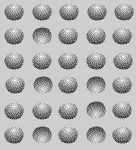
Shadow is also an important cue for depth. Look at the illustration below. It consists of several rows and columns of shadowed circular shapes which appear to be either bumps or hollows. The only cue to whether each shape is a bump or a hollow is the shadow. Some of the circular shapes are shadowed towards the lower portion and others are shadowed towards the upper portion. Those which are shadowed in the lower portion seem to be bumps, whilst those which are shadowed at the top seem to be hollows.
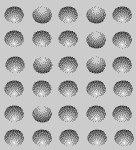
Turning the whole image upside down (see the following illustration) seems to turn the bumps into hollows and the hollows into bumps. It seems that the 'default' assumption is that the light comes from the top.
Photographs in which both near and distant details are in focus can offer dramatic illustrations of how objects which are very close can sometimes seem unnaturally large. For instance, a photograph of someone lying down with their feet towards can make their feet appear so large that the effect is humorous. Where the medium is a drawing or a painting we may even feel that the effect is 'unrealistic'. What is interesting is that were we to be there in person looking from the same perspective at the person who is lying down we would be very unlikely to notice anything odd at all. Someone who is used to doing life-drawing with a pencil held at arm's length as a measuring-stick may be more conscious of this phenomenon - at least when they are drawing.
-
Visual Perception 1: Searching for Patterns
-
Visual Perception 2: The Third Dimension
-
Visual Perception 3: Selectivity and Perceptual Constancy
-
Visual Perception 4: Cultural and Environmental Factors
-
Visual Perception 5: Individual Differences, Purposes and Needs
-
Visual Perception 6: Context and Expectations
-
Visual Perception 7: Gestalt Principles of Visual Organization
-
Visual Perception 8: The Moving Image
-
References and Suggested Reading

|